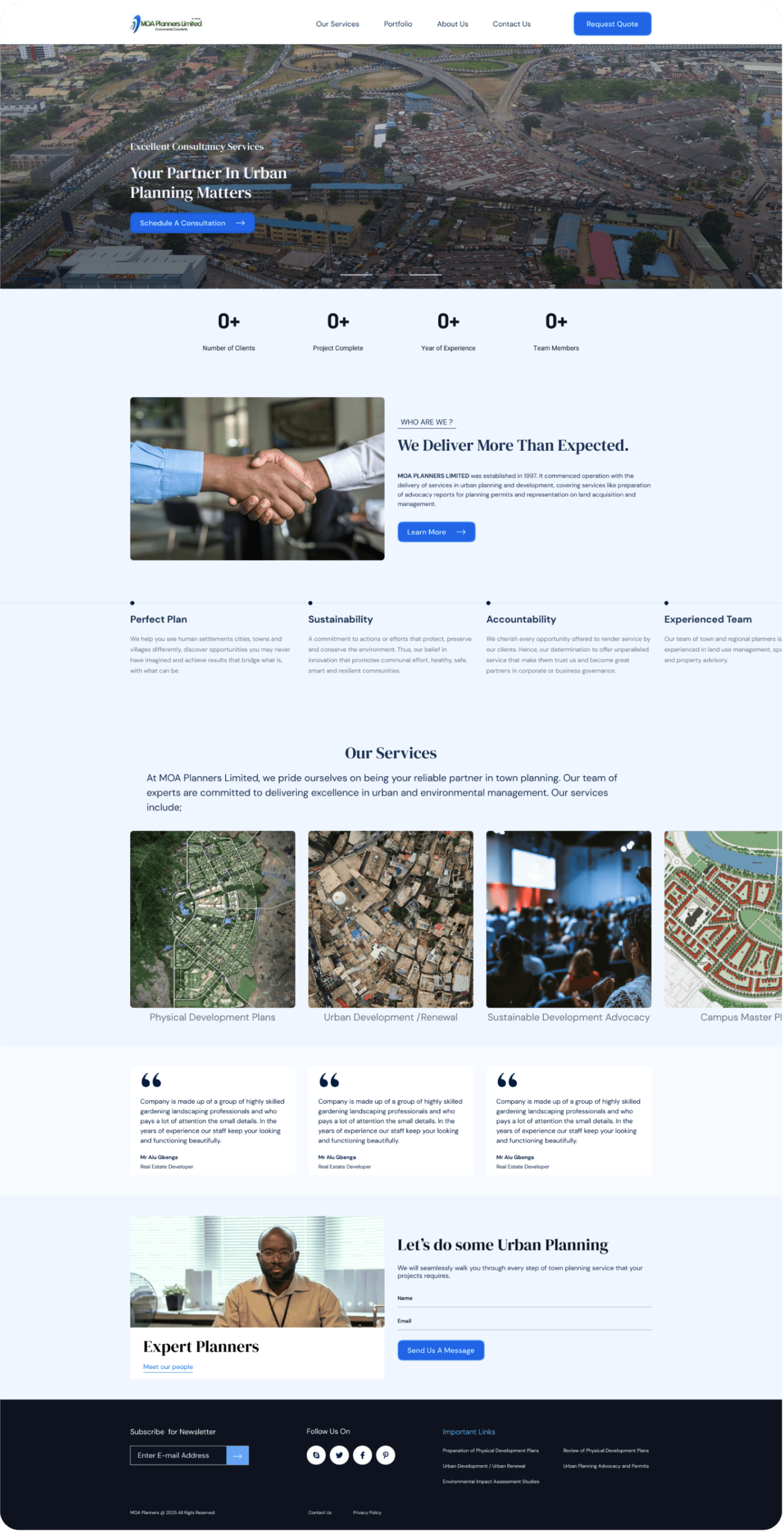
MOA Planners
To redesign the urban planning website by improving its professional outlook, simplify the interface, ensure all services were clearly reflected and optimize for different screen sizes.
Urban Planning
UI Redesign
Prototyping
Wireframing
Mobile & web design

Challenge
The project was undertaken concurrently with my urban planning internship, leaving limited time for design work. Also, the client had a very limited budget.
The client had little technical knowledge and no understanding of design tools making it difficult to communicate design decisions.
Diversity. The website needed to cater to different user groups, businesses, and government officials, with different needs and expectations.
Time and budget
Communication barrier
Diversity
Solution
I prioritized core features and developed a lean design process by focusing on high-impact solutions and using free resources, iterative prototyping and rapid feedback loops.
Created simple, pdf presentations, provided detailed explanation and interactive prototypes to help the client visualize the final product. I also did regular check-ins for feedback throughout the design process.
I did a market research on similar products, interviewed some of the potential users of the website and developed a flexible interface that catered to user needs without losing functionality.
Efficiency
Communication
Research

DM Serif Display
A
Line height
120%
A
Letter Spacing
0%
DM Sans
A
Line height
150%
A
Letter Spacing
0%
Royal Blue
#2063E6
Main brand color
The color conveys a feeling of trust, sophistication and authority, it was applied liberally to the layout as its main identity.
50
EFF6FF
100
DCEBFD
200
95C8FB
300
3F88F2
400
2063E6
500
2146AC
600
203E88
700
182753
800
152147